The Erasmus Student Network is proud to announce the adoption of a new logo and visual identity, endorsed in April 2019 during the Annual General Meeting in Thessaloniki by the members of the organisation.

The change is opening a new chapter for one of the biggest student organisation in Europe, in the year of its 30th anniversary. As ESN continues to evolve and face global challenges, it is only fitting that the visual identity reflects this evolution. Following the desire for more unity, brand recognition and modern look, extensive and interactive consultations spanning over 2 years were facilitated at all levels of the network. At the Annual General Meeting in Thessaloniki, these ideas became a reality as the representatives of ESN sections approved the update of ESN logo.
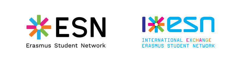
Designed by Jan Hrubý and a team of volunteers, it is composed of the refreshed ESN star, the acronym “ESN” and the full name of the organisation below. The logos of the ESN Local and National Organisations are now created by adding their name in the second line of the descriptor.
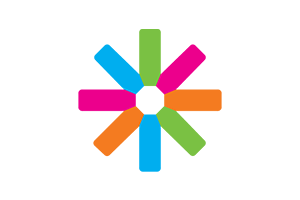
Keeping up with the times, the new version ensures readability and it is optimised for digital use. Commemorating our history, we retain the strongest elements of the brand such as the colour palette and the logo’s core element, the star. The colourful branches, now of equal length, represent the diversity of the Erasmus Generation supporting each other.
Changing the face of the brand is never easy. That’s why the transition to the updated logo and visual identity system will happen gradually. Officially adopted by the international level in August 2019, it will be rolled out globally to the 40 National and over 520 Local Organisations by summer 2021. During the transition period, both versions of the logo will be allowed.
While updating our online presence with the new logo, we invite our collaborators and partners to use the updated ESN Media Kit.